7 Features Your Website Must Have in Order to Be Successful

You want your business to thrive, right? Looking to increase your credibility and exposure to potential customers? Need an easy way to drive revenue? Good news! There is a simple answer to get your business on the right track and one that might seem like common sense.

In order to achieve all the above goals, you need to ensure you company has a website.  I know, you’re thinking, of course, everyone knows you need a website today.  So, you did the due diligence and launched a website for your business.  But what if that website doesn’t seem to be performing for you like it should?  Just having a website doesn’t mean customers are automatically going to flock to your business.  Having a website is like having a storefront without a sign.  You have a location that allows people to do business with you.  The only problem is, they don’t know who you are, where you are located, and what you do.  That is why business owners invest in signage, marketing, product placement, and, of course, a website.

So, you know you need a website, but just like with a storefront, your website must be a great representation of your business and what you stand for.

Here are 7 must-haves with your website:

1. Responsive Website Design

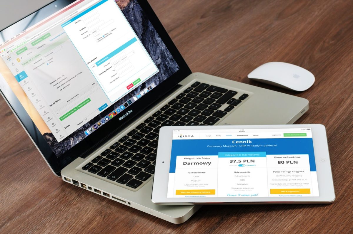
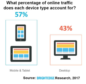
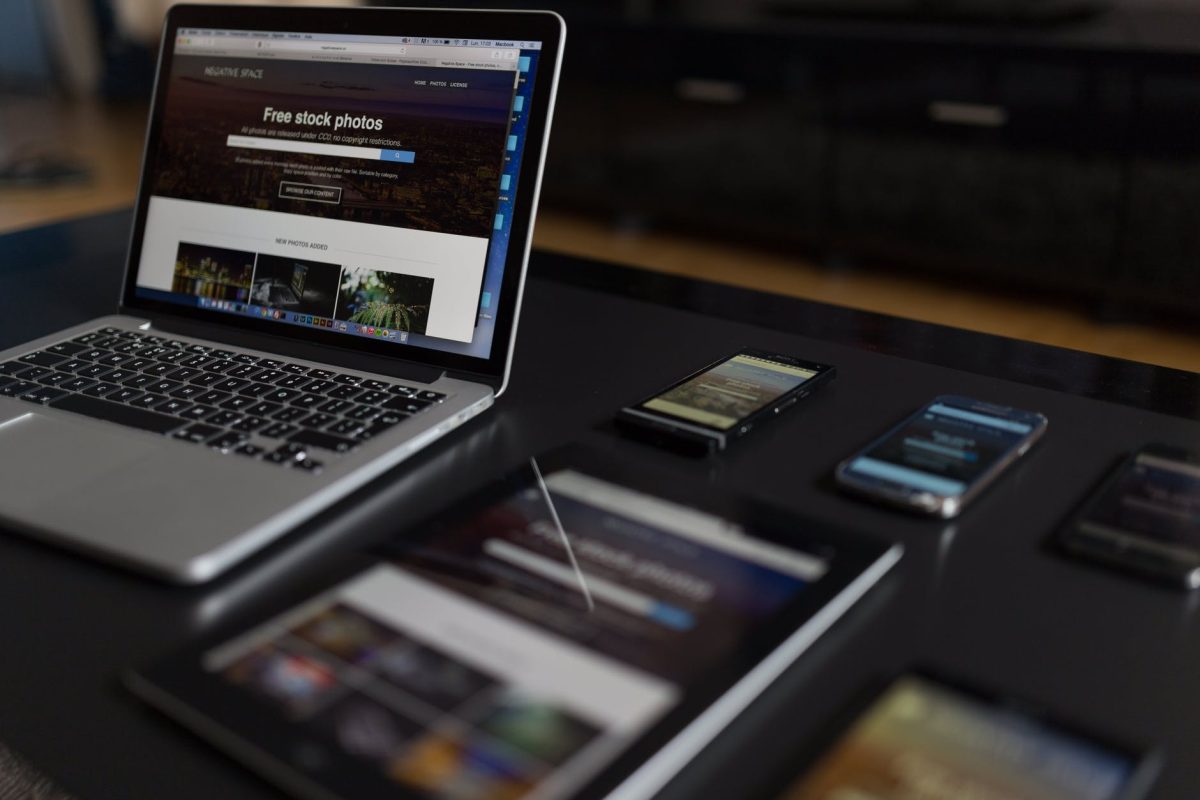
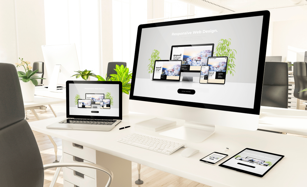
Responsive web design simply means your website automatically conforms to the best user experience, regardless of the device. 70% of website traffic comes from mobile devices. To stay on top of your competition, your website must have a comparable user experience across all devices, whether mobile or desktop.

2. Clear Navigation

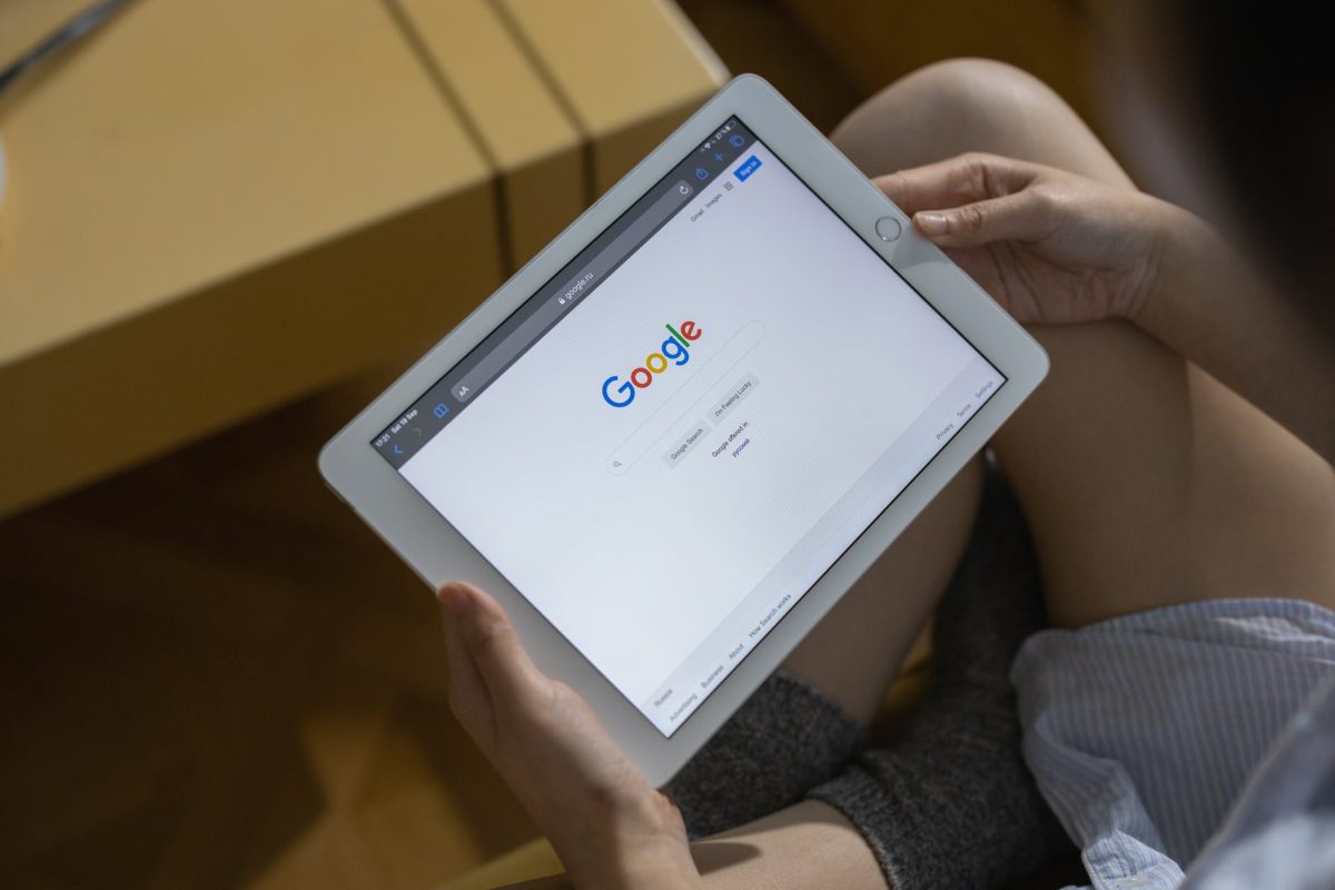
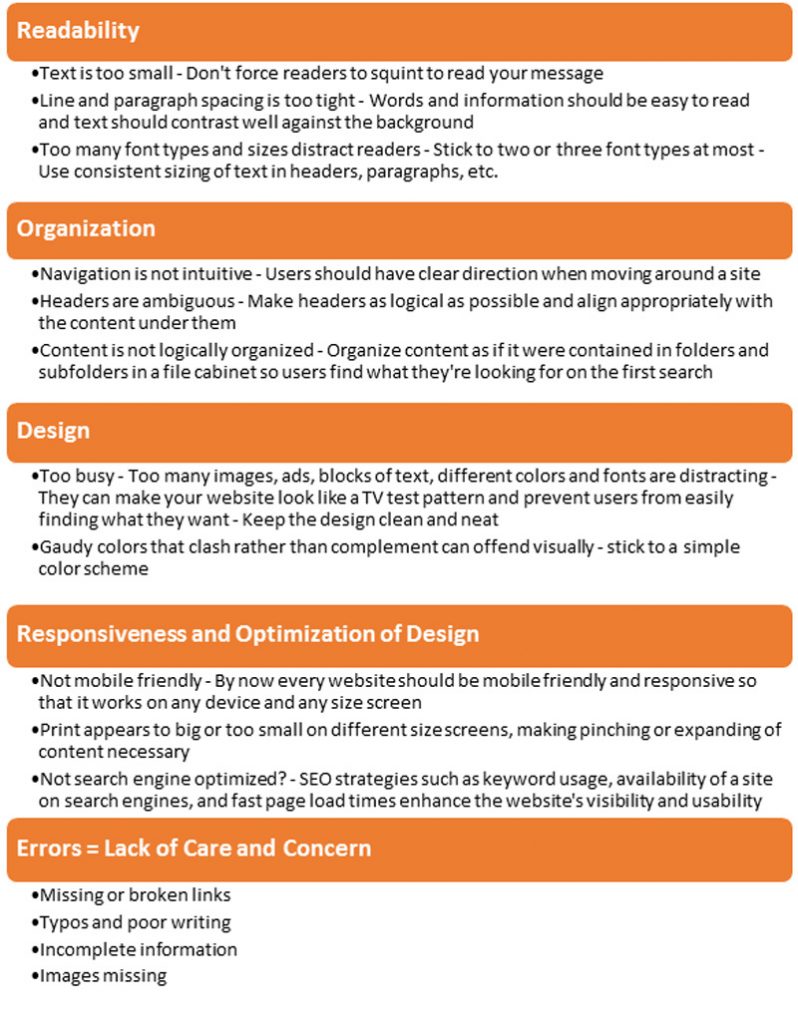
Think about your own experience on a poorly designed website. You are trying to find contact information or specific content about the company’s services and yet, you get lost in a never-ending scroll and click monstrosity of annoyance. You end up leaving that website to find a competitor with a clearer direction. People are looking for quick, simple, and efficient. Having a clear navigation path on your site will enable a better user experience, as well as aid in your search engine optimization growth.

3. Content, Content, Content!

When it comes to your website, content is king! You must infuse high quality, engaging content to attract your ideal consumer AND keep them on your site. People coming to your site have a problem in which they are hoping for your products or services can solve. Say they need a new roof. They want to investigate a bit to see if it is the best company to hire to replace their roof. They want to know you have knowledge and experience in the area. They want to be sold on the fact that your company is the best in the business when it comes to roofing. That is all done with content. Content is what draws the customers to your website. Relevant and engaging content is what pulls your website to the top of search engine results. Content is what is going to set you apart from your competition.

4. Thoughtful Design

You always want to be thinking about the user experience when it comes to your website design. Having an explosion of colors, a gazillion pictures, and 24 various fonts and sizes will make any visitor dizzy and drive them right onto the pages of your competition. Your color pallet, images, and content should all be placed with purpose throughout your site and guide the user to the information you want them to focus on. Think of it like a road map, guiding your ideal customers to exactly what you want them to do.

5. Customized Call-To-Action Buttons

Also referred to as CTAs, this is one of the most critical parts of your website. Call-to-action buttons guide your customer to interact with you in a preferred manner. It could guide them to fill out a form, or maybe to call now, (which they can do right from your site!). Maybe it is to complete a sale right on your site if you are an ECommerce business. Your call-to-action buttons are a subset of your well thought out design. They remind your customer to engage with them and further their interaction with your business to get closer to the sale.

6. Consistency

It might sound repetitive, but consistency is so important for a good user experience. Consistency on your website means that your colors, images, content, navigation, messaging, and overall message has a cohesive flow throughout the entire site. When a customer lands on your website, whether they land on your home page or a product page within your site, they should know right away what business site they are on, what you do, and how you can solve their problem. A great deal of this will focus on your brand messaging, a topic we will explore deeper in a separate blog.

7. Engaging Visuals

There is an old saying in marketing that is still true today. If you were to remove all the text from an advertisement, a customer should still be able to tell you what you do or what you are selling based solely on the image used in that ad. The same is true for your website. The first thing people will focus on is one that lands on your site if the images. Your images need to tell a compelling story. Much like your content. They need to be engaging and purposeful in both placement and messaging.

Another concept to embrace is video. People are 10 times more likely to engage with a video versus a static image. You are allowing people to learn about your business, what sets you apart, and pull them in with compelling content – all at the ease of watching a video. A well-executed design that incorporates both static images with thoughtful and poignant video will take your website to the next level.

Just like your food in your refrigerator, don’t keep your website past its expiration date.  Websites created in the 90s and early 2000s are in desperate need of a refresh!  Technology changes quickly today.  For your website to stay relevant and be found by customers online, you need to keep your content fresh and your platform and design current to your customers standards.  

How Can You Get Your Website to Attract More Customers?

Perfexion is a full service, interactive agency. We harness the power of great design, the most advanced technologies, and strategic branding to enhance your professional presence across the web and beyond. Click here to get a FREE website audit and customized solutions for your business.

SEO Strategies: Mobile versus Desktop

Over the past decade, smartphones, tablets, and PCs have facilitated a vast and virtually ubiquitous online presence. Smartphones and tablets, in particular, have revolutionized the way consumers seek, search, and shop for their goods and services. These days, consumers anywhere can, with a few quick keystrokes, connect with local businesses at any point, and from any channel, in a matter of seconds. While mobile SEO, searches and  design have gained significant traction over the last couple of years, accounting for over half of all online traffic, the prevalence of desktop searches should not be overlooked or underestimated.

Mobile versus Desktop: How Do They Differ?

You might be surprised to learn that, despite the ongoing debate about which device is preferable, SEO for mobile and desktop adhere to the same basic principles and best practices. That said, there are some key differences that must be acknowledged and implemented into your overall strategy for each platform. Let’s begin by exploring why mobile and desktop have different rankings, how to compare them, and what these differences mean for your long-term SEO goals.

According to recent statistics gathered by web experts at BrightEdge, 79 percent of listings have a different rank on mobile devices compared with PCs or desktops. Furthermore, they found that the top-ranking result for a given query is different on desktop and mobile 35 percent of the time.* So, what do these statistics really suggest? First, that mobile and desktop searches use vastly different algorithms to determine SERP listing data, and second, that any successful Search Engine Optimization strategy requires a highly developed understanding of user intent.

Most popular browsing platforms—Internet Explorer, Firefox, and Google Chrome—are working to provide the best user experience for searchers, regardless of what device they are using to conduct the search. In order to do this, however, they need to establish some degree of user intent; in short, they need to anticipate the needs of the users and meet them accordingly. Although user intent differs per person (and device) the general consensus is that the intent of mobile users is more immediate and transactional, whereas the intent of desktop users is more generic and informational.

Based on the preceding generalizations, we can further surmise that users conducting searches on their mobile devices are more likely to seek and yield localized results, whereas users searching for products or services on a desktop are more likely to browse generally on various ecommerce sites.

Search Engine Optimization, SEO, is also inextricably linked to the conversions likely to occur on each device. Those of us with smartphones, for example, know firsthand how convenient the click-to-call feature is, which is what most users use. Conversely, desktop users are more inclined to send emails or submit contact forms regarding their specific inquiry.

Deciphering User Intent Through Micro-Moments

Google anticipates and interprets user intent by examining their micro-moments; that is, by analyzing the ways consumers behave online. Using these micro-moments, the search engine can process the incoming queries accordingly. If a user is searching for a product or service in Plymouth Meeting, a map proximate to their location will appear. Alternatively, if a user is searching for specific information, the Google “Quick” answer box will readily appear.**

Micro-moments are particularly telling for mobile users, who are generally in need of immediate results. As an example, a mobile user searching for “fresh produce” is likely looking to buy fresh produce right away, so SERP may return a local map showing grocery stores or farm stands nearby.

Alternatively, on a desktop, a user searching for “fresh produce” is more likely conducting a general search. The user could be looking to order fresh produce online, but they could also digress to researching the health benefits of fresh produce, searching for recipes, or looking at other pertinent content.

In sum, these micro-moments impact how SERP is constructed, and determine the relevancy of the content that appears. Site developers, marketers, and webmasters need to recognize how mobile users interact in these micro-moments—as well as how intent differs between mobile devices and desktop—if they want to ensure that the generated content corresponds to both device and user intent.

What Does the Future Hold for Online Searches?

In 2015, Google confirmed that mobile searches officially surpassed desktop searches worldwide. Two years later, in 2017, research conducted by BrightEdge showed that 57 percent of all online traffic comes from mobile devices like smartphones and tablets.*

Mobile SEO, Mobile Web Design
Mobile and Desktop Traffic

In 2018, mobile searches are continuing to outpace desktop searches, and this upward trend is projected to continue well into the future. As a response to this surge of mobile users, Google is developing a “mobile-first” algorithm as a way to compel webmasters to design their mobile sites first, prior to designing their desktop sites.

The popularity of mobile searches, however, does not diminish or negate the importance or prevalence of desktops, which account for 43 percent of all online traffic. Similar to mobile devices, desktops generate their own SERPs. Furthermore, descriptive keywords and longer articles are better suited, at least presently, for desktops and PCs.

Whatever the future holds for online searches, it is essential to have separate SEO strategies for both platforms and to track and monitor their performances regularly. Free resources like Google Analytics, for example, provide a fuller picture of such metrics — including advertising impressions, affiliate clicks, engagement rates, conversions and revenue rates, and even what percent of search traffic comes from mobile devices and desktop, respectively. These metrics will allow you to see how well you are reaching your target demographic, and also how users interact with your site on both platforms.

For best results, you would do well to hire a professional marketing company with the expertise to develop content that is compatible on both mobile devices and desktops. If you need assistance making your website responsive and mobile-ready, Perfexion, Inc. is here to help. Our qualified professionals specialize in managing and maximizing clients’ web content, ranking, and search results traffic.

Contact us to learn how we can make your website more secure and keep your SEO efforts and strategy strong.

WEBSITE pfxn.com
E-MAIL hello@pfxn.com
CALL 610-783-7660
SAY HELLO

* https://searchengineland.com/mobile-desktop-seo-different-results-different-content-strategies-281643
** https://searchenginewatch.com/2018/05/08/seo-strategies-and-keyword-rankings-mobile-versus-desktop/

Google Changes Ranking Algorithm Based on Mobile Website Readiness

Using Mobile-Readiness to Get Found on Google

Every so often, Google tweaks and refines how they return web pages in response to a search query. Google continuously assesses their search algorithms to make sure the results they provide are the most useful they can be based on the information input into the search query.

Understanding How Google Performs a Search

Without getting into the technical weeds about Google’s search algorithms and how they work, it helps to understand, in nontechnical terms, how Google performs a search and some of the information Google relies on when providing search results. One key factor that comes into play is the level of relevance of the content on a web page to the search being performed.

Google tries to determine how specific or broad a search is. For example, did the user type in cat or exotic Persian shorthair cat? Google analyzes the words a user types into the search bar, and even makes allowances for typos (cat bred vs. cat breed). And, depending on the words or terms a user included in their search (keywords), Google’s lightning-fast search for results includes looking at web pages and matching the keywords to web page content where they appear in titles, headings, and text.

A user’s personal Google search settings and patterns also inform Google and can come into play in helping Google return relevant search results. For example, a user’s previous or recent searches as well as their location can factor in the results Google returns to a search query.

Companies and website owners naturally want to be found when a customer or potential customer searches for a product they sell or service they offer. But, before Google will rank a website high in search engine results, they want to be certain that visitors to the website to have a good user experience. Businesses can help themselves in that regard by ensuring the content on their website is always fresh and the information they provide is of high quality and valuable to the people who visit their website. The business should come across as trustworthy, and the content on the site representative of a company that is an authority in its industry or on a particular topic.

Mobile vs. Desktop Search

Without a doubt, we have gone mobile. People everywhere rely on their mobile devices – smartphones and tablets – to shop, for entertainment, for conducting business, for learning and information, for communicating, and much more. As far back as 2010, industry experts predicted our use of mobile devices would surpass our use of desktop PCs. Those experts were right. According to a March 2017 report by comScore, 69% of the time we spend consuming digital media is done on a mobile device as compared to a desktop computer – and that includes performing searches on Google.

As a result, Google will be changing their optimization rules over time so that websites will only be ranked based on the mobile version of the website. Up until quite recently, it did not matter if a website was not optimized for viewing and use on mobile devices. In fact, countless sites continue to work today on only desktop computers and not on mobile devices. But, with every update to their ranking algorithms that Google performs, Google is moving away from ranking websites based on their desktop version to what they call mobile-first indexing, which ranks the mobile version of the site in terms of its content, links, certain data, and how viewable the site is on a mobile device.

Understanding Mobile-first Indexing

In anticipation of user behavior trends, Google has been slowly moving toward mobile-first indexing – a search ranking system that gives websites a mobile-friendly ranking boost. With mobile-first indexing, Google looks first at the mobile version of a website for indexing and for how they determine a site’s ranking. But, if a company has only a desktop version of their website, Google will still include that site in its index, but the sites rankings could be negatively affected.

In time, Google will no longer consider the desktop version of a website to be the primary version, but will instead give that preference to the mobile version of the website. To minimize the impact to your desktop site, you will want to ensure that your desktop and mobile sites are, in essence, created equal – that the desktop site uses responsive design and the content is optimized for mobile use.

Do I Need to Change My Mobile Site to Improve Indexing and Ranking?

There are ways to enhance your mobile website and prepare for when Google eventually makes the change to mobile-first indexing. First and foremost, the content on your mobile site should be just as high quality and valuable as the content on the desktop version of your website, whether you are using text, images, or video. Google should be able to both crawl and index all your mobile content. The key takeaway is to understand that Google will crawl mobile content, so content on your mobile website should be as relevant and valuable as possible, which ultimately serves to improve your rankings.

Other checks and updates you should make include, for example, the mobile site’s metadata and social metadata, structured data, XML, sitemaps, and more – to ensure you are using, tagging, optimizing, etc. versions of each that work within the mobile environment.

Companies can no longer ignore (or afford to ignore) the requirement to have a mobile-responsive website. In the past, a company created two versions of their website: one for desktop and another for mobile. Over the upcoming months, Google will rely more and more on a company’s mobile site or mobile responsiveness of a desktop website when it applies mobile-first indexing. Keywords, search terms, and quality content will continue to matter, perhaps even more than a URL that today is used to organize site content.

To better understand the ins and outs of webpage ranking and mobile responsiveness, or determine what your current website needs in order to address Google’s move toward mobile-first indexing, consult with a professional web developer.

We are a Philadelphia-based web design and development company located in Plymouth Meeting just outside King of Prussia. The experts at Perfexion, Inc. specialize in helping clients market their business online – and on mobile – effectively and profitably.

Contact Us Today!

WEBSITE pfxn.com
E-MAIL hello@pfxn.com
CALL 610-783-7660
SAY HELLO

Understanding Mobile Marketing

Understanding Mobile Marketing

Without a doubt, the world has gone mobile. People everywhere rely on their mobile devices—smartphones and tablets—to shop, for entertainment, for conducting business, for learning and information, for communicating, and much more. As early as 2010, industry experts predicted our use of mobile devices would surpass our use of desktop PCs. They were right. According to a March 2017 report by comScore, 69% of the time spent on digital media is attributed to mobile usage over desktop.
Most businesses today understand the need to do digital marketing. If they have a website—as they should—they are already doing a form of digital marketing via the internet. Many of these companies also develop separate marketing campaigns to work on mobile devices. Those who are not have some serious catching-up to do. Now, more than ever, ensuring your business is optimized and ready for use on mobile devices should be a priority.

What is Mobile Marketing

If you are new to mobile marketing or have limited knowledge of what mobile marketing entails, the first question you should ask is: What is mobile marketing? Mobile marketing is a digital—online—marketing strategy that encompasses multiple channels for reaching a specific target audience via their mobile device. Digital marketing channels range from display ads to apps to email coupons to text messaging (SMS) to video and more.

Compare these to traditional marketing channels such as print (newspapers, brochures, magazines) and broadcast (radio and TV ads). Two key differences stand out between digital and traditional marketing: the cost to run a marketing campaign and the ability to measure a campaign’s success. In a word, digital marketing is more cost effective than traditional marketing, and measuring the results and success of a digital campaign is quick and easy, and can even be done in real time if necessary.

Why Focus on Mobile Marketing

Now that you understand the value in digital marketing, the next question to ask is: Why do mobile marketing? Google provides plenty of reasons in their report entitled “Micro-Moments: Your Guide to Winning the Shift to Mobile.” They define micro-moments as “critical touch points within today’s consumer journey, and when added together, they ultimately determine how that journey ends.” In other words, consumers expect companies to be available to address their needs at any time. For many people, their smartphone is their lifeline; as such, they use their device to conduct searches, find places, do things, and shop and compare prices virtually around the clock.

Mobile marketing campaigns vary depending on business type and service offering. Finding what works for your business is key. For example, a restaurant might find that sending an email containing a discount coupon is more effective at garnering new and repeat business than placing a coupon in a monthly mailer. Most users would rather bring up the coupon or code on their phone than cut one out of a magazine.
Keep these tips in mind when planning your own mobile marketing campaign.

Mobile Marketing Tips

• Take a test drive. Test the mobile marketing strategies your favorite businesses (or competitors) promote. Buy something or place an order from a mobile app to get a feel for a shopping experience. See how the ordering and payment processes work. When you test different mobile marketing strategies, you figure out what you like or don’t like, and what works or does not work. The experiences will give you a better feel for what might work for your business.
• Check your website. Is it user friendly? Is it mobile ready, meaning, does it display and function properly on tablets and phones? Having a mobile ready mobile responsive website is a must if you want users to have the best possible experience with your online business.
• List your business on location-based platforms that let you run promotions on different mobile apps and social media. When you do, users can check in and take advantage of your current promotion.
• Talk with an expert. A digital marketing company will provide recommendations for increasing your online presence. Additionally, they can integrate platforms and tools you use, as well as track results and adjust programs easily.

Businesses today should rely on mobile marketing as a key—if not the key—marketing strategy for getting in front of their target audience. For more information on how mobile marketing can work for your business, contact the professionals at Perfexion, Inc. today. They specialize in helping clients market their business effectively and profitably.

Contact Us Today!

E-MAIL hello@pfxn.com
CALL 610-783-7660
SAY HELLO

Website Issues and Website Ranking Concerns

Website Issues – Technical SEO

Top 5 Website Issues

You’ve spent hours building and setting up your website. It’s finally done. You set up analytics to track how well your website performs. At the end of that arduous journey, you even give yourself a pat on the back as congratulations for your accomplishment. Unfortunately, you’re the only one passing out congratulations. Why? Because the average user finds the aesthetic presentation of your website unattractive and the organization and information lacking. Along the way, you failed to treat the design and development of your website the way you would build and design a bricks-and-mortar store.

A user’s experience on a website should be every bit as good as a customer’s physical in-store experience. Customers and potential customers who walk into a store off the street should feel welcome and be able to find what they’re looking for quickly and easily. If the products in your store are set up willy nilly on the shelves, sales people shout out to you from opposite sides of the building, and dust bunnies float around your ankles, chances are good you are going to turn around and walk right out. The same holds true for your website. One mistake on your site is all it takes to destroy credibility in your business and can keep a user away for life.

Most people have heard the phrase “Build it, and they will come,” and understand the meaning it espouses. But, the phrase “Build it well, and they will come” more correctly promotes the analogous idea that a website must be done well for people to not only come, but to stay and conduct business – shop, buy, call, contact – whatever you want them to do.

Most people look at a variety of websites on any given day, whether on their phones, their laptops, or their tablets. Most of these same people don’t give the websites they view a second thought because these sites look nice, feel comfortable, and function properly. The user achieves whatever it is they went to the site for in the first place. In a word, their user experience is optimum. And when user experience is good, the website’s bounce rate – the rate at which users leave a site after visiting just a single page – is low.

What do good websites have (or do) that bad ones don’t? Because your website is your virtual store, ease and convenience of use are not all that matter. Consider the distinct aspects of your website’s design and development, and how they might affect a user’s decision to stay or leave. By addressing these appropriately, you ensure visitors have the best possible experience and will want to keep coming back for more.

Top Website Issues

Top Website Technical Issues, Technical SEO

The design and function of your website is just as important as the information your site provides and the products and services you sell there. Professional web designers and developers are trained to build websites that appeal visually, function appropriately, attract users, and keep bounce rates down. Don’t jeopardize the profitability of your business by building your own website and missing the mark on any of these key details.

Philadelphia web design company Perfexion, Inc. specializes in web design and development, including monitoring and managing the performance of clients’ websites. They are experts at building brands and all types of online marketing. Because they thrive on helping clients be as successful as possible, they collaborate with you to understand your business and build a website that targets your ideal customer and increases relevant traffic.

Contact Us Today!

WEBSITE pfxn.com
E-MAIL hello@pfxn.com
CALL 610-783-7660
SAY HELLO

Responsive Web Design: Every Search, Click, and Scroll Matters

Responsive Web Design: Every Search, Click, and Scroll Matters

When it comes to responsive websites, customer service and user experience go hand in hand. If users have a good experience with a website that responds to their every search, click, and scroll – that is, with every interaction they have on that site – they will equate those interactions to good customer service. The opposite holds true as well. Your products and services may be the best in the business, but if a user can’t locate them on your website, or they click on a link and are taken to an error page, or worse, they can’t properly view your website on their mobile device, they will equate that to poor customer service. At which time, they will click away and never return.

Responsive websites should always be fully accessible, readable, and functional for people who view them (error-free goes without saying) – regardless of the type or size of screen the website is being viewed from. Statistics indicate that more than 65% of web searches performed today are done on mobile devices such as smartphones and tablets. If your website does not adjust dynamically for ease of reading on different devices, or images get blurry when a user pinches and expands them, your website is not responsive or mobile ready.

When building your website, responsiveness of design is one key factor to keep in mind. WordPress, the most popular tool for creating and managing websites and blogs, offers plenty of website themes with responsive design. That means that users will be able to easily read and use your website whether they’re looking at it on their desktop computer, their laptop, their tablet, or their mobile phone.

WordPress is popular for a variety of reasons, not the least of which are its ease of use and community forum that provides support on virtually any topic. In addition, WordPress as a content management system (CMS) offers:

  • Easy content creation and publication of web pages, posts, media, and more
  • Control over who can access/update your website and the functions they are permitted to perform
  • Drag-and-drop functionality to quickly and easily add images and other media to your website
  • Plugins to add other features such as calendars and social media
  • Search engine optimization so your website gets ranked and found on the internet

If your website is more informational and contains fewer functions than a website designed specifically for e-commerce, you can manage it perfectly well with WordPress CMS. As you build, change, and manage your WordPress website, with its responsive design functionality, new content and features will adapt to the responsive design, so you can be assured of always providing the best customer service and user experience to anyone who visits your website.

Two other content management systems assure website owners of responsiveness of design when used: Sitefinity™ and Kentico. If your website is complex, such as an extensive corporate website, and/or contains e-commerce (online shopping) functionality, Sitefinity and Kentico offer high-end CMS solutions to support the detailed and more technical needs these types of websites require.

Similar to WordPress in terms of the page management and user access features they offer, Sitefinity and Kentico offer additional functionality right out of the box:

  • Websites are mobile ready, which means you create your website once and it automatically adapts to a variety of devices and screen sizes. You can preview how your website will appear on different screen sizes, and adjust content if necessary.
  • With responsiveness of design, you present a unified brand message and you do so consistently across all types of devices and marketing channels such as social media, which makes for a singular user brand experience.

Beyond the direct website experience, a CMS can be set up for other functions you want as part of your user experience. For example, you probably want to include a series of automated emails to be sent as certain user activity triggers them: Welcome, abandoned cart, Thank You, delivery confirmation, and more. Or you want to send product news, sale information, or coupons. Given the mobile nature of our society, more people are doing business on their mobile devices than on desktop computers. Responsive design makes sure your entire message gets seen and is easy to respond to, so people will want to do business with you.

Website owners should choose the most appropriate content management system for their needs – based on the amount and level of functionality and complexity of their website. But, whether your website is simple or complex, if you want your website to display accurately on both desktop and mobile devices, make sure every aspect of your website contains responsiveness of design.

Responsive design is vital to engaging customers and users. If they can’t view and navigate around your site on their smartphone or tablet, they will move on to one they can. If you have limited expertise in website design and management, or you would rather spend time running your business than managing your website, consider consulting with a professional web design and development company.

We are a Philadelphia-based web design and development company located in Plymouth Meeting just outside King of Prussia.  We are a web design and development company that understands responsive design and how it interplays with content management systems – CMS.  Perfexion specializes in helping clients market their business online effectively – and profitably. Contact us today to schedule your consultation.

Contact Us Today!

WEBSITE pfxn.com
E-MAIL hello@pfxn.com
CALL 610-783-7660
SAY HELLO

Why Hire a Professional Web Design Company

Why Hire a Professional Website Design Company

Few business owners dispute the need to have a website. How else will current and prospective customers know about the products and services their business offers and the unique value they bring to the market? Or the company’s history and mission? Or how to find or communicate with the business? Frequent changes and updates to a website support a company’s ability to attract new customers and expand into different markets, if desired.

Done right, a website also serves as a forum for business owners to target, reach, and communicate with, desired clients; educate and inform visitors to their site about topics related to business offerings via blogs, company updates, or a FAQ section; and receive feedback, inquiries, and concerns about customer needs.

Some business owners prefer to design and build their website themselves, via readily available user-friendly apps and platforms (although user-friendly is debatable). They might be looking to save money or already have a design in mind. Sound familiar? While these may seem like good reasons to build your own website, by doing your own, you risk losing business if your website comes across as unprofessional, disorganized, not secure—or worse, no one knows your website exists.

Your site may have eye-catching colors, attractive images, and easy-to-read/easy-to-understand content (text). But these are only a small portion of what goes into making an effective, high-performing website. For all the beauty and graphics your site displays, if your website is not coming up in internet searches, the weekend and evening hours you spent building the site were for naught.

Professional Web Design Company

The 4 Best Reasons to Hire a Professional Web  Development Firm
If you’re still not convinced your website needs a professional touch, consider these top 4 reasons to hire a professional web design company.

1. Visual appeal and function – The text, colors, and graphics on your website matter. The look and feel of your website, and how easily users can navigate the pages and find the information they’re looking for also matter. Professional designers will tie these elements together to make sure your website is attractive and functional, as well as user-centered.

2. Search engine optimization – Search engine optimization (SEO) is critical if your website is to be found when people perform an internet search for your type of business on one of the major search engines such as Google, Yahoo!, or Bing. This traffic, derived from organic searches rather than from a user clicking on an ad, is like gold. The the traffic is due to people looking for exactly what you have to offer! SEO involves using both the right keywords and phrases as well as the right creative elements to improve your search engine rankings and generate traffic to your website.

Web designers work in conjunction with web developers, who add the necessary ingredients behind the scenes to ensure a website not only gets found on the internet, but also ranks high in relevant searches.
What is more, web design, along with solid web development, makes use of programming language, behind-the-scenes codes and tags, and SEO (Search Engine Optimization) to set up all the technical aspects of a website.

3. Value-added technology – Every website can benefit from using additional technologies that help drive traffic to the site. These include videos that demonstrate how products work, an RSS feed that provides the latest industry updates, and links to other pages or relevant materials on the internet or on social media, among others. And, when properly positioned and coded, all enhance the ranking of your website for internet searches. Do-it-yourself web designers either don’t include these valuable technologies or they add or place them in a way that does not benefit the business.

4. Results tracking and analytics – A professional web designer will know how to design your website so you get more conversions.  Website developers will drive the actions you want visitors to your website to complete. This includes filling out a contact form, click to another page, call you, or buy a product. The pros will set up your Google Analytics so you can track results via a dashboard. To measure success, you’ll track such Key Performance Indicators (KPIs) as new visitors to your website vs. repeat visitors, number of visits to your site before a user makes a purchase. Other KPIs are bounce rate (how often a user clicks off a page),  time on a page —and many others. By understanding these metrics, you or your designer will know what is working and where you might need to make changes to improve performance.

Be Competitive

If you truly wish to be competitive in the online marketplace, use a professional web design service for your website. The vast majority of businesses today rely on their website—and its optimum performance—for the success of their operations. The value provided by a web design service far outweighs the results you might obtain by designing and managing your website on your own. For more information on how a professional web designer can help your business, contact Philadelphia based Perfexion, Inc. today. We specialize in helping clients market their business online effectively and profitably. We are a Philadelphia-based web design and development company located in Plymouth Meeting just outside King of Prussia. We specialize in making sure clients’ websites are technically sound and perform to the best of their ability at all times.

Contact Us Today!

WEBSITE pfxn.com
E-MAIL hello@pfxn.com
CALL 610-783-7660
SAY HELLO